
In the realm of data visualization, the bullet chart stands out as a powerful tool for tracking performance against a target. Invented by data visualization specialist Stephen Few, the bullet chart was designed to enhance the traditional gauge chart, offering a more compact and informative way to display data. Resembling a thermometer, bullet chart can display one or many columns that can be color-coded, making it an effective tool for understanding variance.
Features of the Phocas bullet chart
Phocas has long recognized the value of the bullet chart, incorporating it into its data analytics solution. The Phocas bullet chart boasts several features that make it a versatile and user-friendly tool:
-
Compact size: The bullet chart is designed to run vertically, making it adaptable to the available space. This compact design ensures that it can fit into various dashboards without overwhelming the viewer.
-
Multiple measures: Users can display multiple metrics and qualitative ranges together within a single bullet chart. This feature allows for a comprehensive view of different metrics in one place, facilitating easier comparison and analysis.
-
Versatility: Whether you need a single bullet chart to represent an overall total or multiple bullets to compare regions, people, or products, the Phocas bullet chart can accommodate your needs.
-
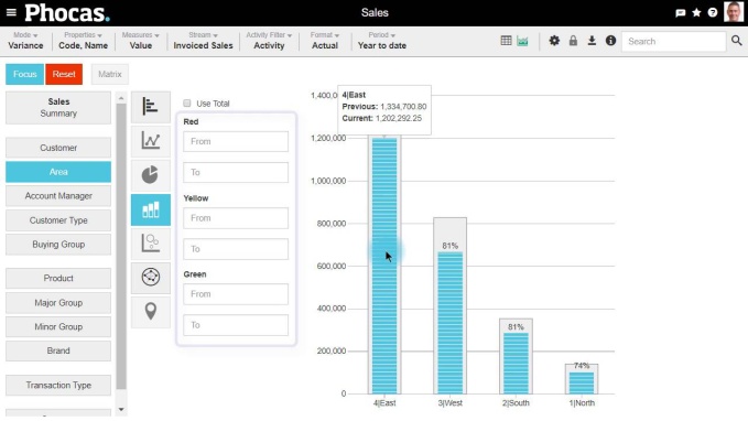
Ease of reading: The bullet chart is designed to be easy to read and informative to the eye. The gray column typically represents a target, while the colored column shows actual value performance, providing a clear visual representation of how well targets are being met.
Using a bullet chart?
The bullet chart's utility extends beyond its design features. It is a practical chart type for various applications, particularly in tracking sales performance. For instance, in the below video tutorial, the bullet chart is used to compare sales results across divisions with the previous year's sales. This visual representation allows users to quickly identify which divisions are performing well from the dataset. Additionally, hovering the cursor over the chart reveals the actual figures, offering both a visual and numerical view of sales side-by-side.
Creating a bullet chart in Phocas data analytics is straightforward and can be done in four easy steps:
-
Select a period: Start by selecting a period, such as year-to-date (YTD), to ensure the numbers align with the current point in time.
-
Choose variance mode: To compare the current year to the previous year, select variance mode. This step is crucial for visualizing the difference between the two periods.
-
Switch to chart view: Move from numbers to charts by clicking on the chart icon. To view the results in a bullet chart, navigate to KPI charts and select the bullet chart option.
-
Analyze results: The bullet chart will display the performance of different divisions. For example, the east division might have achieved 90% of the previous year's total sales with two months remaining in the year. To enhance the chart's usefulness, you can set ranges with color coding similar to traffic lights, making it clear which divisions are closest to their targets.
Enhancing the bullet chart
To further improve the bullet chart's effectiveness, consider adding a step to compare overall variance. By clicking on the "use total" button, you can display three figures: last year's sales, current sales, and the variance. For instance, if the variance for today is 15%, it means sales are at 85% of last year's total. This total figure can be added to a dashboard for a quick overview of performance.
Bullet graphs vs. bar charts
While bullet charts are incredibly useful, it's important to understand how they compare to other chart types, such as bullet graphs and bar charts. A bullet graph is a variation of the bullet chart, often used to display a single measure against a qualitative scale. It includes a primary measure (the actual value), a comparative measure (the target value) and qualitative ranges to provide context.
On the other hand, bar charts are one of the most common chart types used in data visualization. They display data points as rectangular bars, with the length of each bar representing the value of the data point. Bar charts can be used to compare different categories, track changes over time and visualize distributions. They can be formatted in various ways, including stacked bar charts, which show the composition of different categories within a single bar, and grouped bar charts, which display multiple bars for each category.
Use cases and applications
Bullet charts, bullet graphs, line charts and bar charts each have their distinct use cases and applications. Bullet charts are ideal for tracking performance against targets, making them perfect for KPI dashboards and performance reports. Bullet graphs are useful for displaying a single measure in the context of a qualitative scale, providing a clear visual representation of how well a target is being met. Bar charts, with their versatility, can be used in a wide range of scenarios, from comparing sales figures across regions to visualizing survey results as percentages.
Creating bullet charts in Phocas, Excel, Tableau, and Power BI
Creating bullet charts in popular data visualization tools like Phocas, Excel, Tableau, and Power BI is straightforward. In Excel, you can use the built-in chart options to create a bullet chart by combining a bar chart with additional formatting and reference lines. Phocas offers more advanced features, allowing you to create interactive bullet charts with data labels, time series and qualitative ranges. There are shortcuts into data visualizations withing Phocas by making a right-click on a featured measure.
The bullet chart is a valuable tool in the data visualization toolkit, offering a clear and concise way to track performance against targets. Incorporating bullet charts into your data visualizations and storytelling allows you to reveal deeper insights into your data and provide additional context for your sales performance.
Phocas's implementation of the bullet chart exemplifies its commitment to providing effective and user-friendly data visualization tools. Whether you are comparing sales across divisions or tracking overall performance, the bullet chart can help you understand variance and achieve your targets.


Empowering businesses with intuitive data analytics, driving informed decisions for growth and profitability. We make people feel good about data.


Find out how our platform gives you the visibility you need to get more done.
Get your demo today