Sort and summarize your data
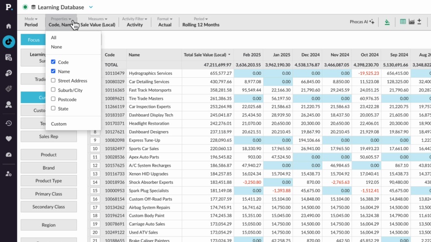
Supporting documentation
Related video tutorials
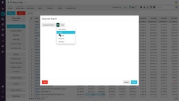
Narrow your search by entity or property
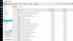
Matrix Variance and Matrix Share mode
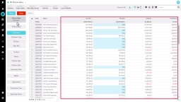
Change the mode
Popular search terms


When you visit any website, it may store or retrieve information in your browser, mostly in the form of cookies. This information might be about you, your preferences or your device and the primary purpose is to ensure the website functions as you expect it to. While this information typically doesn't directly identify you, it contributes to a more personalized browsing experience. Because we respect your right to privacy, we provide the option to control certain types of cookies. Click on the different category headings below to learn more and modify our default settings according to your preferences. However, blocking some types of cookies might impact your experience of the website and the services we are able to offer.